
TapClicks, the leading provider of Smart Marketing solutions, announced the release of its new suite of advanced visualization widgets which greatly enhances and expands data visualization capabilities for analysis and reporting. This latest innovation introduces a variety of dynamic and interactive chart types which provide users with more engaging data representations and deeper insights into their data. Leveraging leading-edge web technology, these new visualizations are designed to offer unparalleled customization and clarity in data presentation.
The new and/or enhanced chart types include:
- Bubble Chart (new): Now users can visualize data points with varying sizes and colors to represent three-dimensional datasets intuitively.
- Bar Chart: Now includes lollipop and radial bar charts, offering more ways to compare data across categories with clear, horizontal, vertical, or radial bars.
- Line Chart: Now includes the ability to add regression/trend lines, providing enhanced trend analysis, predictive insights, and simplified data interpretation.
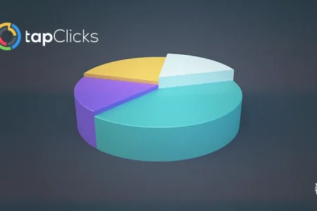
- Pie Chart: Now includes the option for donut charts, providing visually appealing and easy-to-understand circular charts to show proportions and percentages of a whole.
- Funnel Chart: Now includes pictorial and pyramid options, allowing the display of funnel metrics using images or icons for a visually engaging and easily relatable representation.
- Gauge Chart: Now includes multi-metric gauge charts to represent multiple data points within a single gauge, providing a comprehensive overview of performance indicators.
- Column and Line Combo Chart: Combine column and line charts to present dual-axis data seamlessly, with options for clustered, stacked, and layered combo charts.
Also Read: Arcalea Announces Strategic Expansion into Australia Through Partnership with CRM Strategy
The new visualizations have been built on an advanced technology foundation, ensuring high performance, responsiveness, and flexibility in their ability to represent useful insights from data. Users can expect a seamless experience when customizing charts to fit their specific analytic needs, making data-driven decisions more efficient and effective.
“With the release of these state-of-the-art visualizations, TapClicks cements its position as a leading provider of analytics and reporting technology products,” commented Chel Heler, Executive General Manager of TapClicks. “Our commitment to innovation and excellence ensures our users have the best tools available to turn data into actionable insights.”
SOURCE: Tapclicks