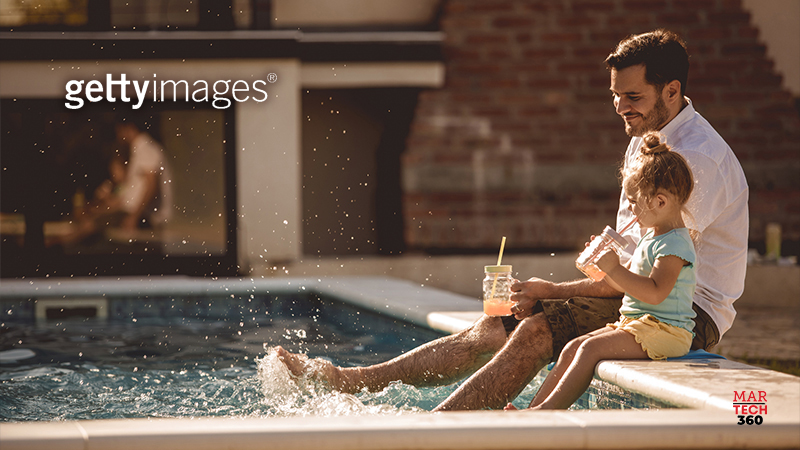
If you’re even somewhat familiar with photography, you’ve likely heard of the concept of composition. In simplest terms, composing a photo means “laying it out” before you take it. It means considering what the subject of your photo is, and positioning that subject in frame, as it relates to the background.
This is easy to consider if you’re a photographer or content creator, but how do the principles of composition help you to tell your stories in marketing projects or brand work? There are many ways to use composition to your advantage in your designs—so here’s what you can do:
1. Be sure there’s a clear separation between your subject and your background
When the background is out of focus in an image, it tends to keep the viewer’s eyes on the subject that is in focus. This may sound obvious but ensuring a clean division between what’s in focus and what isn’t is one of the easiest and most powerful ways to direct your audience’s eyes where you want them to look. This is particularly useful for portraits, product shots, and action photography.
2. Leave room for text using negative space
Building some more on the blurry background point—all of that negative space can be used for other design elements. A common practice in advertising is using an image with a blurry background so you can lay text in that space. Text is much easier on a blurry background, and it also ensures that your subject is still a key focus of the photo.
3. Be very clear of what (and where) your subject is when choosing pre-shot imagery
In its simplest terms, composition could be described as the relationship between the subject matter you are trying to capture and its background. When it comes to choosing pre-shot images that have already been composed by the creator, this means knowing very clearly what your subject is in a given photo and where it’s positioned. The message you are trying to convey can easily get lost so make sure the subject of your image has room to breathe and is not cropped too close to the edge of the frame.
4. Keep the placement and dimensions of your end project in mind
On the subject of cropping, there can be a lot to consider with composition as it relates to the location of the subject in your image. It can be very hard to find an image that works in, say, half a dozen different banner sizes. Always remember to choose an image based on the space you’re trying to fill, and if you’re cropping an image of a product make sure logos and key elements are still in frame and aren’t too close to the edge of those frames. This can take a lot of trial and error. Finding an image with a clear subject, and lots of negative space around that subject, can make it a lot easier to adjust the image for hyper‑specific or even multiple placements.
5. Use the rule of thirds to find new compositional ideas
You may have heard about the rule of thirds, but even if you haven’t, you’ve definitely experienced it. On your smartphone, you usually have the option to turn on a grid when taking photos that feature two vertical and two horizontal lines intersecting on your camera’s viewfinder. This creates nine quadrants, and these guides are helpful for positioning subjects in a frame in more interesting ways than, say, just centering them.
When it comes to pre-shot visual content, this comes into play as you look at background components (such as the horizon line on landscape photos) or subject placement (such as a car on left third of a frame, with the appearance of movement toward the right). These positions provide a sense of symmetry, but also tell a story. Aligning your subject in the lower left or lower right quadrant can create an interesting composition. Content creators use the rule of thirds to more easily place the subject in focus while giving the background room to breathe.


Comments are closed.